Don Bluth's work in animation is incredibly famous, and he's contributed a great deal to the medium over the years. This particular scene from The Secret of NIMH stands out to me. What is most compelling to me about this scene is the atmosphere. The dramatic staging and gloomy color palette contribute to this, but one of the more eerie aspects is that the primary light source is the eyes of the owl. This is all hand-drawn animation, so creating an actual glowing effect required an entirely new idea/technology. This is real-world light being shone through individually cut-out pieces of film - part of why the glowing is so convincing. This is ridiculously hard to reproduce digitally and takes an absurd amount of time to replicate physically. The exaggerated features and movements of the characters are also huge contributors to this animation's success. Their emotions are easier to read, and their movements carry a lot of weight, making it feel like they actually inhabit the spaces they're moving in.
Wolfwalkers is a much more recent work, and the most unique thing about it is the style used. Animation does not have to be clean to be successful, and this is a good example of that. In this case, their goal is to create the effect of a painting coming to life and to replicate the natural flow of nature. A lot of neat visual tricks can be pulled off this way - shown here is how it works with rapid movement. Backgrounds become more abstract and lines become much more jittery to show how fast the characters are moving and to make the environment feel like it's also alive. Some other examples of this animation style being useful include -
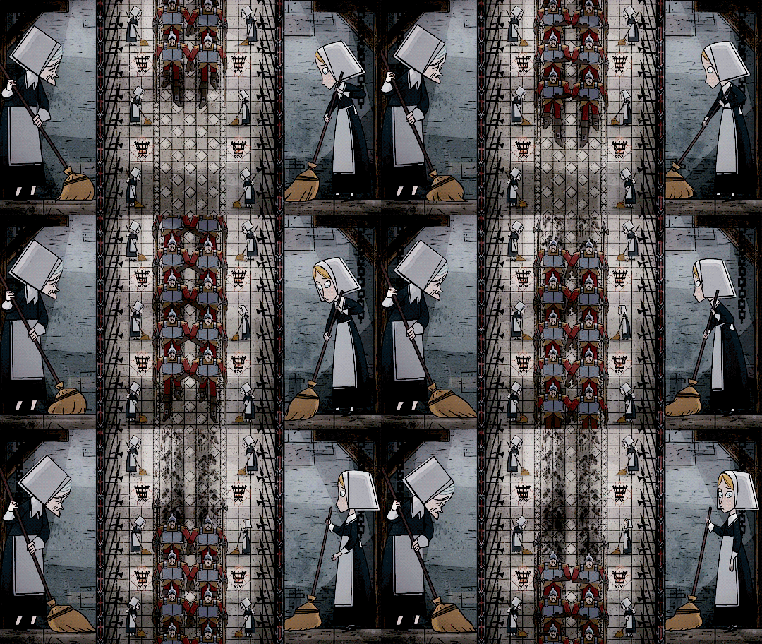
- 17th-century woodcut and tapestry imagery - scene paneling and the structure of the city
- jagged lines taking over the screen during moments of emotional significance
Once again, character movements and faces are heavily exaggerated to make their emotions more apparent. I think this is especially important for non-human characters as it's harder for the audience to assume emotions based on subtler cues. The running animation here is fluid, but more literally since it's directly emulating the movement of water.


.png)
No comments:
Post a Comment